The yet-to-be-officially-incorporated town of Braddock received its first brewery in 1865, just as the Civil War was drawing to a close and seven years before Andrew Carnegie built his Edgar Thomson Steel Works a mere few blocks away. A handful of small breweries came and went over the next half century until Prohibition wiped the industry off the map in 1920, yet only two breweries have called Braddock home since our disastrous “noble experiment” was repealed: the General Braddock Brewery, founded by father and son Dan and Art Rooney in 1933, and The Brew Gentlemen Beer Co., founded by two 23-year-olds from Boston, Massachusetts and Kona, Hawaii eight decades later.

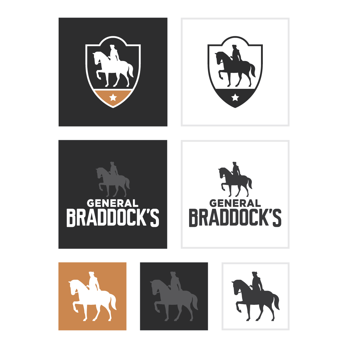
For us, choosing Braddock was choosing to be part of its rich history – one of battlefields, Bessemer converters, and beer. When it came time to name our flagship product, paying homage to that history was a must. General Braddock’s IPA was thus born, taking a number of visual cues from the old General Braddock’s Brewery (with the Rooney family’s blessing): the horse and rider, (ostensibly representing the General himself), the crest with the rounded top, and the five-pointed star. And thus, we wound up with the imagery we’ve used in some form or another for the past five years:

As we prepare to begin our company’s next chapter – one in which General Braddock’s will play a prominent role – our beloved flagship is receiving its first graphical update in seven years:
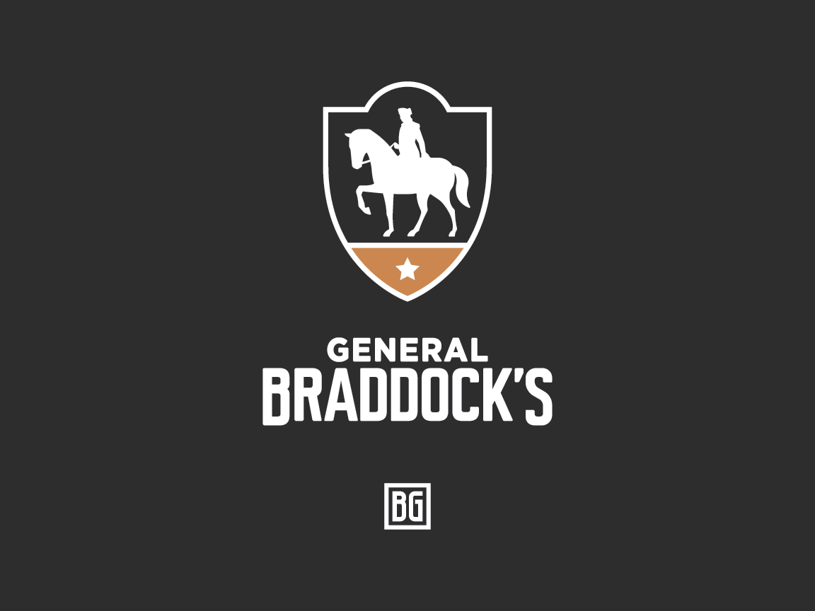
In designing the rebrand, we were operating with a much more developed visual identity for the brewery overall, not to mention several more years of design experience under our belts. We needed to bring General Braddock’s into the same visual universe as the rest of our company, while still drawing upon the same historical references that influenced the design of its predecessor.
The main quality we hoped to achieve with this new design is a sense of timelessness – after all, a beer you can always come back to needs to look the part. It was therefore influenced heavily by two things we felt were as timeless as they come: the crest as a visual motif, and historical monuments.
Crests, badges, and other ornamental borders have long been a part of the American brewing tradition, and the original mid-30s labels from the Rooney brewery were no different. Our intention was to update those graphics for a more modern era without sacrificing their nod to the past, a feat we found that European football club crests often accomplished well. Using the same color palette and flat design we’ve always employed, we adapted the crest from the original General Braddock Pilsener label to better suit its new context.
The somewhat lumpy 2012 rendition of the horse and rider felt direly in need of an upgrade, for which we looked to historical monuments, specifically equestrian statues. Even though the theory that the position of the horse’s legs denotes the fate of the rider doesn’t hold much water, we opted to follow that convention (partially for visual effect, and partially because why the hell not). Given that General Edward Braddock met his end four days after the Battle of the Monongahela due to wounds sustained in combat, one raised leg it is.
With the production and distribution of General Braddock’s slowly ramping up in anticipation of our current expansion, you’ll definitely be seeing more of The General’s new look.